I think an all black away kit with gold coloured trim would look smart.JedMaxwell wrote:I reckon it'll be a black away kit, or maybe orange.
Next seasons kit choice?
Re: Next seasons kit choice?
05 May 2022 13:55
Re: Next seasons kit choice?
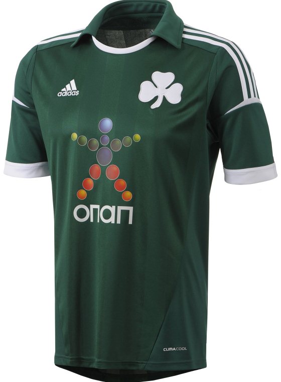
09 May 2022 00:31Something like this Paul? Any whispers on kit supplier?paultheroyal wrote:Away kit is green.... something different for next season.

Re: Next seasons kit choice?
09 May 2022 08:54For about the 10th time, it will be Macron, they just haven't announced it yet.royalp-we wrote:Something like this Paul? Any whispers on kit supplier?paultheroyal wrote:Away kit is green.... something different for next season.
-
NathStPaul

- Hob Nob Super-Addict
- Posts: 11747
- Joined: 19 Feb 2019 14:21
Re: Next seasons kit choice?
09 May 2022 08:56I love it when you give people facts and they are either too blind or too stupid to listen. Of course it is Macron and of course the kit will not be green.Hendo wrote:For about the 10th time, it will be Macron, they just haven't announced it yet.royalp-we wrote:Something like this Paul? Any whispers on kit supplier?paultheroyal wrote:Away kit is green.... something different for next season.
-
Brogue

- Hob Nob Super-Addict
- Posts: 17459
- Joined: 02 Mar 2021 20:38
- Location: Radio AE #3 Winner 2025
Re: Next seasons kit choice?
09 May 2022 12:18Hi kespaultheroyal wrote:Away kit is green.... something different for next season.
-
Uke

- Hob Nob Legend
- Posts: 24876
- Joined: 17 Apr 2004 16:24
- Location: Слава Україні! Героям слава! @UkeRFC
Re: Next seasons kit choice?
09 May 2022 13:17Onanroyalp-we wrote:Something like this Paul? Any whispers on kit supplier?paultheroyal wrote:Away kit is green.... something different for next season.
Re: Next seasons kit choice?
09 May 2022 14:51All I ask is that we have a solid panel on the back so it's possible to read the shirt numbers.
Re: Next seasons kit choice?
09 May 2022 14:53Or have them in red at least. The gold was a really nice touch and looked lovely in pictures and close up but from any distance away it was totally unreadable.SCIAG wrote:All I ask is that we have a solid panel on the back so it's possible to read the shirt numbers.

Re: Next seasons kit choice?
09 May 2022 16:35Some would even go as far as suggesting the radical idea of having a white square where the numbers go, that meakes them readable, without the whole back of the shirt needing to be a single colour.SCIAG wrote:All I ask is that we have a solid panel on the back so it's possible to read the shirt numbers.
Re: Next seasons kit choice?
09 May 2022 17:36…or just better things to do than scroll back through the thread. Imagine being so annoyed on such a petty subjectNathStPaul wrote:I love it when you give people facts and they are either too blind or too stupid to listen. Of course it is Macron and of course the kit will not be green.Hendo wrote:For about the 10th time, it will be Macron, they just haven't announced it yet.royalp-we wrote:
Something like this Paul? Any whispers on kit supplier?
Re: Next seasons kit choice?
09 May 2022 18:53Found the red used by the youth sides just as difficult to read tbh.Hendo wrote:Or have them in red at least. The gold was a really nice touch and looked lovely in pictures and close up but from any distance away it was totally unreadable.SCIAG wrote:All I ask is that we have a solid panel on the back so it's possible to read the shirt numbers.
Good point, that's better than looking like Leeds (although a blue panel is fine).tmesis wrote:Some would even go as far as suggesting the radical idea of having a white square where the numbers go, that meakes them readable, without the whole back of the shirt needing to be a single colour.SCIAG wrote:All I ask is that we have a solid panel on the back so it's possible to read the shirt numbers.
-
John Smith

- Hob Nob Regular
- Posts: 4741
- Joined: 20 Jan 2010 23:47
- Location: Astronauts The New Conquistadors
Re: Next seasons kit choice?
10 May 2022 15:03Every year people moan about not having hoops all the way round and then the season they do, people are still unhappy. Just no pleasing some is thereSCIAG wrote:All I ask is that we have a solid panel on the back so it's possible to read the shirt numbers.
Re: Next seasons kit choice?
11 May 2022 16:45It divides fans, but I hate a back panel. It ruins a hooped and striped shirt.John Smith wrote:Every year people moan about not having hoops all the way round and then the season they do, people are still unhappy. Just no pleasing some is thereSCIAG wrote:All I ask is that we have a solid panel on the back so it's possible to read the shirt numbers.
All we need is numbering that has a centimetre surround and the numbering stands out fine.
I also don't know why fans that watch the team week in, week out, need to see numbers and letters
Re: Next seasons kit choice?
11 May 2022 16:47Not for every player, but it does help with the academy boys coming through that many people will not have seen before.PATRIQT wrote:It divides fans, but I hate a back panel. It ruins a hooped and striped shirt.John Smith wrote:Every year people moan about not having hoops all the way round and then the season they do, people are still unhappy. Just no pleasing some is thereSCIAG wrote:All I ask is that we have a solid panel on the back so it's possible to read the shirt numbers.
All we need is numbering that has a centimetre surround and the numbering stands out fine.
I also don't know why fans that watch the team week in, week out, need to see numbers and letters
What I don't think helps is the font of the EFL letters and numbers, it is pretty oxf*rd terrible.
-
JedMaxwell
- Member
- Posts: 626
- Joined: 15 Feb 2021 13:36
Re: Next seasons kit choice?
11 May 2022 19:32Yep, the EFL typeface is overdesigned crap. They obviously need to have something different for marketing purposes, I get that, but something close to the Prem numbers would be best.Hendo wrote:Not for every player, but it does help with the academy boys coming through that many people will not have seen before.PATRIQT wrote:It divides fans, but I hate a back panel. It ruins a hooped and striped shirt.John Smith wrote: Every year people moan about not having hoops all the way round and then the season they do, people are still unhappy. Just no pleasing some is there
All we need is numbering that has a centimetre surround and the numbering stands out fine.
I also don't know why fans that watch the team week in, week out, need to see numbers and letters
What I don't think helps is the font of the EFL letters and numbers, it is pretty oxf*rd terrible.
Re: Next seasons kit choice?
11 May 2022 21:32The worst thing is the U23 matches where they don't even have names.Hendo wrote:Not for every player, but it does help with the academy boys coming through that many people will not have seen before.PATRIQT wrote:It divides fans, but I hate a back panel. It ruins a hooped and striped shirt.John Smith wrote: Every year people moan about not having hoops all the way round and then the season they do, people are still unhappy. Just no pleasing some is there
All we need is numbering that has a centimetre surround and the numbering stands out fine.
I also don't know why fans that watch the team week in, week out, need to see numbers and letters
What I don't think helps is the font of the EFL letters and numbers, it is pretty oxf*rd terrible.
"What's the #2 doing there... oh never mind, that's the #9".
I know the League Cup match was confusing but at least you could tell who Ehibhatiomhan was because of all the letters.
Re: Next seasons kit choice?
11 May 2022 22:18As said though, having hoops all the way round, and having the entire back of the shirt all one colour, are not the only two options.John Smith wrote:Every year people moan about not having hoops all the way round and then the season they do, people are still unhappy. Just no pleasing some is thereSCIAG wrote:All I ask is that we have a solid panel on the back so it's possible to read the shirt numbers.
It's weird. I think shirt numbers started in about 1930, and until about 20 years ago they managed to have legible numbers without needing the entire back of the shirt to be one colour, so I can't see why it's such a problem now.
Re: Next seasons kit choice?
12 May 2022 13:52As with most things in life shirts and shirt numbering has been ruined with loads of over the top branding, flashes, irrelevant “noodling” and the need for some clubs to get a sponsor for every inch. Therefore it’s no surprise that some designs really don’t remain particularly legible. Even 20 years ago things were simpler and generally shirts looked much nicer and I think many may even prefer the days of the 70s and earlier where shirt design really was simple plus you didn’t have the embarrassment of paying to be be someone else’s advert.tmesis wrote:As said though, having hoops all the way round, and having the entire back of the shirt all one colour, are not the only two options.John Smith wrote:Every year people moan about not having hoops all the way round and then the season they do, people are still unhappy. Just no pleasing some is thereSCIAG wrote:All I ask is that we have a solid panel on the back so it's possible to read the shirt numbers.
It's weird. I think shirt numbers started in about 1930, and until about 20 years ago they managed to have legible numbers without needing the entire back of the shirt to be one colour, so I can't see why it's such a problem now.
In Reading’s case putting a gold coloured text on shirts was always going to be ridiculous over a background that’s both white and a darkish blue as gold isn’t strong enough to stand out at distance. If the club continue with hoops “all the way round” then it should really be using black or a strong red colour but then all that probably matters “laws-of-the-game-wise” is that a referee can read the numbers from 6 foot away (is there any law on shirt number legibility, I would have thought numbering would need to be clearly visible across a pitch so if I’m in the East Stand I should be able to read the number of a player standing with his back to me directly opposite on the touch line in front of the West Stand).
-
Snowflake Royal

- Hob Nob Legend
- Posts: 49339
- Joined: 20 Jun 2017 17:51
Re: Next seasons kit choice?
12 May 2022 20:34I'd rather they enforced a strict easily differentiable haircut policy than did anything with the numbers.... they're unreadable most the time no matter what.SCIAG wrote:Found the red used by the youth sides just as difficult to read tbh.Hendo wrote:Or have them in red at least. The gold was a really nice touch and looked lovely in pictures and close up but from any distance away it was totally unreadable.SCIAG wrote:All I ask is that we have a solid panel on the back so it's possible to read the shirt numbers.
Good point, that's better than looking like Leeds (although a blue panel is fine).tmesis wrote:Some would even go as far as suggesting the radical idea of having a white square where the numbers go, that meakes them readable, without the whole back of the shirt needing to be a single colour.SCIAG wrote:All I ask is that we have a solid panel on the back so it's possible to read the shirt numbers.
Re: Next seasons kit choice?
12 May 2022 23:23OK, agreed. I'd go further and say hair colours.Snowflake Royal wrote:I'd rather they enforced a strict easily differentiable haircut policy than did anything with the numbers.... they're unreadable most the time no matter what.SCIAG wrote:Found the red used by the youth sides just as difficult to read tbh.Hendo wrote:
Or have them in red at least. The gold was a really nice touch and looked lovely in pictures and close up but from any distance away it was totally unreadable.
Good point, that's better than looking like Leeds (although a blue panel is fine).tmesis wrote: Some would even go as far as suggesting the radical idea of having a white square where the numbers go, that meakes them readable, without the whole back of the shirt needing to be a single colour.
Exceptions if you are clearly distinct in some other way. Jake Cooper, Seol Ki Hyeon, Liam Kelly, every goalkeeper ever. Kitson and Sidwell are fine because of the height difference.
If there is someone else on the team who has the same skin tone, hair length (long/short/bald), hair colour, and height to within 5cm, then you have to dye yours to an unambiguous colour. Exception if you are a defender and they are a striker, but midfielders can't clash with anyone.
Who is online
Users browsing this forum: Clyde1998 and 9 guests
It is currently 14 May 2026 06:39