News and Views
True Colours
15 August 2013
By Neil Maskell
Strutting around in their pin-striped suits, Reading were only a pair of braces away from being the Gordon Gekko of the Championship at Bolton last weekend. Perhaps we might finally ditch our anachronistic club nickname and finally rebrand ourselves wholly more suitably as 'The Commuters'. As satisfying as a point at the home of erstwhile bogey team Bolton was, the sartorial elegance on display was as much a boost to the ego as anything of qualitative taken from this early season game. On this embryonic evidence, perhaps we should be expecting more than a draw against promotion rivals. Greed is Good. The down-trodden frumps of last season have had a makeover and the sleek LBD on display was as eye-catching as the dominant second half performance at Horwich. Bolton have their Reebok but Reading are Savile Row. Suit you, Sir!
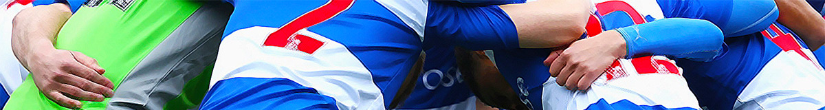
If the black away strip makes us look like Robert Palmer then this season's home effort is more suited to Carlton Palmer. A bizarre effort looking like something that a blindfolded Salvador Dali may have come up with, this season's variation on the classic hooped design is chaotic. Wide white panels on the flanks made poor Royston Drenthe modeling the strip look the size of a house. The reverse of the shirt - due to some spurious league rule about two-tone strips - is all white, allegedly for the benefit of clueless media types whose eyesight is somehow worse than the ignorant, barely concealed agenda they harbor for the most part. I am sure the longer-suffering amongst us will recall 'I HOPE YOU CAN READ THIS, BRIAN MOORE?'; the best banner on display during the 1995 play-off final at Wembley, which lampooned the iconic commentator's season-long bitching about the red-numbered-hooped-shirt combination of that treasured season. That Pelada effort - acrylic tat which clung tightly all over you like a cheap shirt - summed nicely summed up RFC of that era; towards the end of a brilliant season the letters of the sponsors name had been washed clean off the kit meaning that the proud Reading players ran out looking like a pub team displaying the legend 'A T RADE'.
Traditional colours are a source of great pride to supporters of any team, especially clubs such as Reading who largely have an inglorious history bereft of trophies and therefore hang onto such trifling matters of livery in order to claim some unique identity for themselves. Think of the furore in South Wales last year when Cardiff City replaced their traditional blue with a saucy red number for fatuous and fanciful reasons of rebranding. The fact that our glorious colours were ripped off by those cockney Rag'n'Bone spivs of QPR in the 1960s grates with RFC followers - particularly given the latter day Championship celebrity status they have gained through having a high profile manager - for we know that we can lay claim to having originated a blue and white hooped design more than 90 years earlier and more than a decade before the 'Fakes' themselves even existed. Sickeningly, in recent years we have to admit that Steptoe and Son down the road in West London have tended to make a better fist of the design classic than our 'friends' at Puma have thrown up for our boys. Blue shorts again this year? No, no, no!
Team group photos of those 1871 pioneers show our forefathers bedecked in matching caps, blue and white hooped shirts and white knickerbockers. I am not going to get all Anders Breivik about this, but if it was good enough for Mr Sydenham and Co 140 years ago it should be good enough for us now. Criminally, there was a time in the 1950s and 1960s where RFC switched to a puritanical all white effort and later a sky blue home shirt. These proved unpopular with supporters and the club returned to hoops in the late 60s only to ditch them again in 1983 under the brave new world of Roger Smee. One suspects that supporters back then were just happy enough to have a club to support after Maxwell's mooted merger and were not minded to kick up much fuss about club colours as long as they were Reading's colours. That striped Argentinaesque Radio 210 outfit was introduced with laughably crass RFC-timing barely a year after the Falklands War but it remains an unlikely favourite with supporters even now, conjuring up images of a gap-toothed Trevor Senior wheeling away from a muddy penalty area trade-marking the single raised-palm celebration long before anyone had even heard of Alan Shearer. The club have recently stocked a retro, replica version of this shirt which seems rather popular judging by the amount you see worn to matches.
The 1980s - with Thatcherism in full swing - was the decade where nobody cared or gave a damn as to what anyone else thought about anything least of all customer service. RFC stoically stuck to their guns in moving away from the hooped outfits of the dim, distant and largely unsuccessful past as the club enjoyed a renaissance under the Smee regime moving up from 4th to 2nd division in the space of 3 seasons. That they did so wearing a blue and white version of Arsenal's famous colours is a real pity, although the RFC Subbuteo version of the time had at least some uniqueness about it, unlike the 'QPR/Greenock Morton/Reading' edition before. For my own part, those late 80s shirts brilliantly emblazoned with the word 'Courage' were the ones I grew up with, in fact the green Steve Francis goalkeeper top purchased from Nigel Cross Sports was the first I ever owned. Sadly I played more like Stu Francis, but I loved that birthday present so much I practically slept in it.
The TV-interference monstrosity of 1991/92 was the final straw and in those heady days of the fanzine era, Taking The Biscuit were particularly vocal about a return to traditional hoops. Was HAT Painting possibly the most curious shirt sponsorship tie-in in history? Who on earth wants or needs a HAT to be painted? Finally in 1992 - post-Moynihan and Bassett - the football club seemed to give a damn about the feelings of the supporters once more and our rightful colours were reinstated. In fact, we had more hoops than a performing dolphin display team in those days, the away shirt being a rather samey looking yellow and blue variation. This had a knock-on effect of a full on kit clash at various grim northern outposts and memorably Reading had to wear the opposition change colours on more than one occasion. They lined up at Springfield Park, Wigan, for instance bedecked in the home side's red away kit adorned with 'Heinz'. 57 varieties? We didn't have 1!
And for 20 years since - ignoring moans and groans about hoops not reaching right around various versions - it has come to pass that the traditions pioneered by our bearded Victorian founders have again been adopted into the unwritten club constitution ('thou shalt not win promotion via play-off'). This is of course very welcome as we generally have precious little to celebrate other than our identity itself. One must wonder however whether Mr Zingarevich might decide to bury a kalashnikov into history and go along the Cardiff Dragons/Hull City Tigers route one day. Will someone rid me of these meddlesome traditionalists! Red Army!
Share this article: